This spring, we at SMA Mineral updated our graphic manual and took another step in developing and clarifying our brand.
In an industry based on stability, reliability, and long-term perspective, a strong visual identity is important. With a clearer and more consistent profile, we strengthen recognition – both internally and externally.
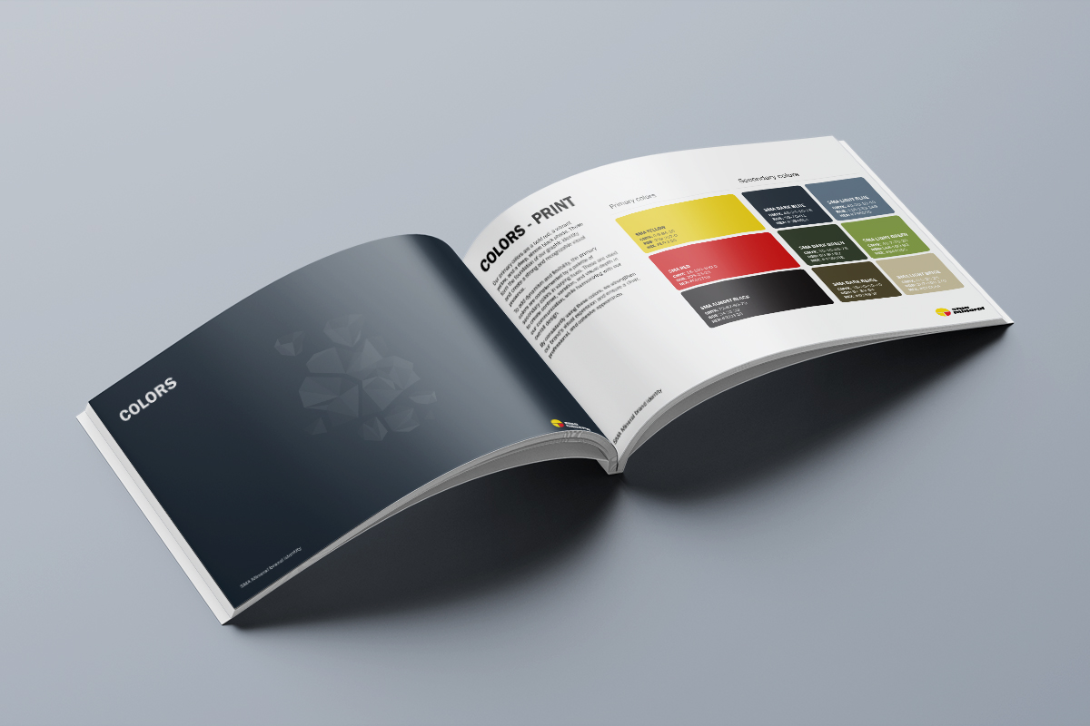
The basics – our logo and typefaces – remain the same, but we have added colors to our palette inspired by nature – earthy tones that connect to the environments where our products originate. These colors give us greater opportunity for variation, while deepening the connection to the core of our operations.
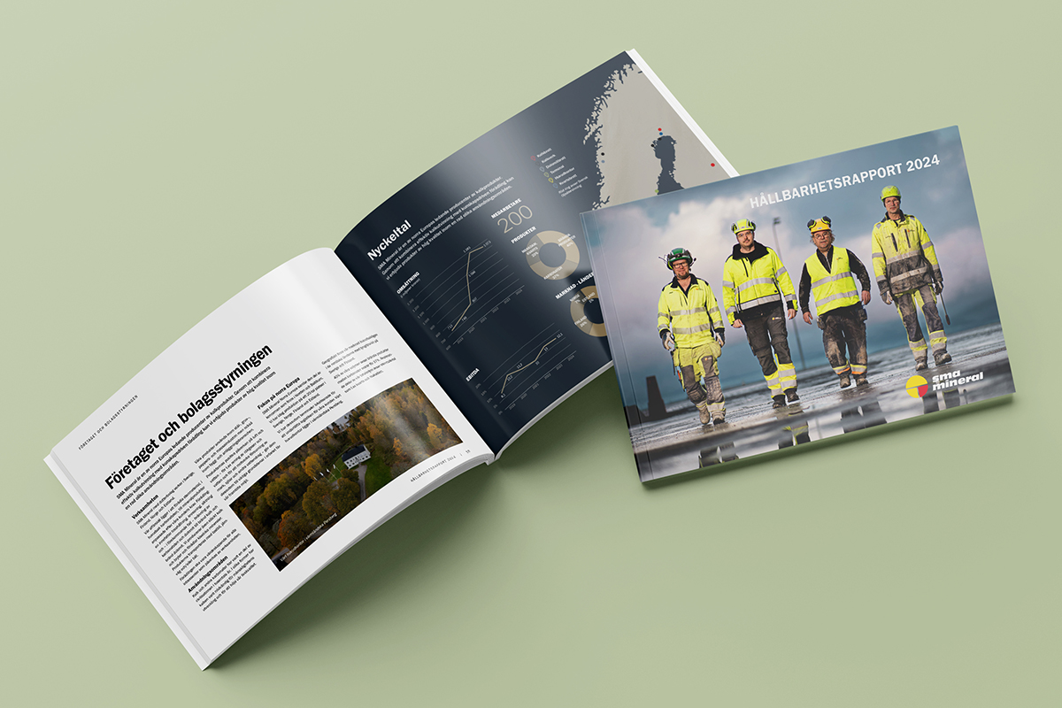
Parts of the profile can already be seen on our new website and in our new Sustainability Report. You’ll find the guidelines for our graphic profile gathered in a manual available for download on our website.
We believe in clarity and quality – and in building something that lasts, both in reality and visually.
you can find our brand identity manual in our press room, but you can also download it here.